
The Lake Winnipeg Foundation needed a web platform to transform complex environmental data into an accessible, exploratory experience for the public, including community members of the region, policymakers, and researchers. My challenge was to design a tool that makes phosphorus pollution data immediately understandable while enabling deep data exploration for diverse user needs.
Context and challenge ahead
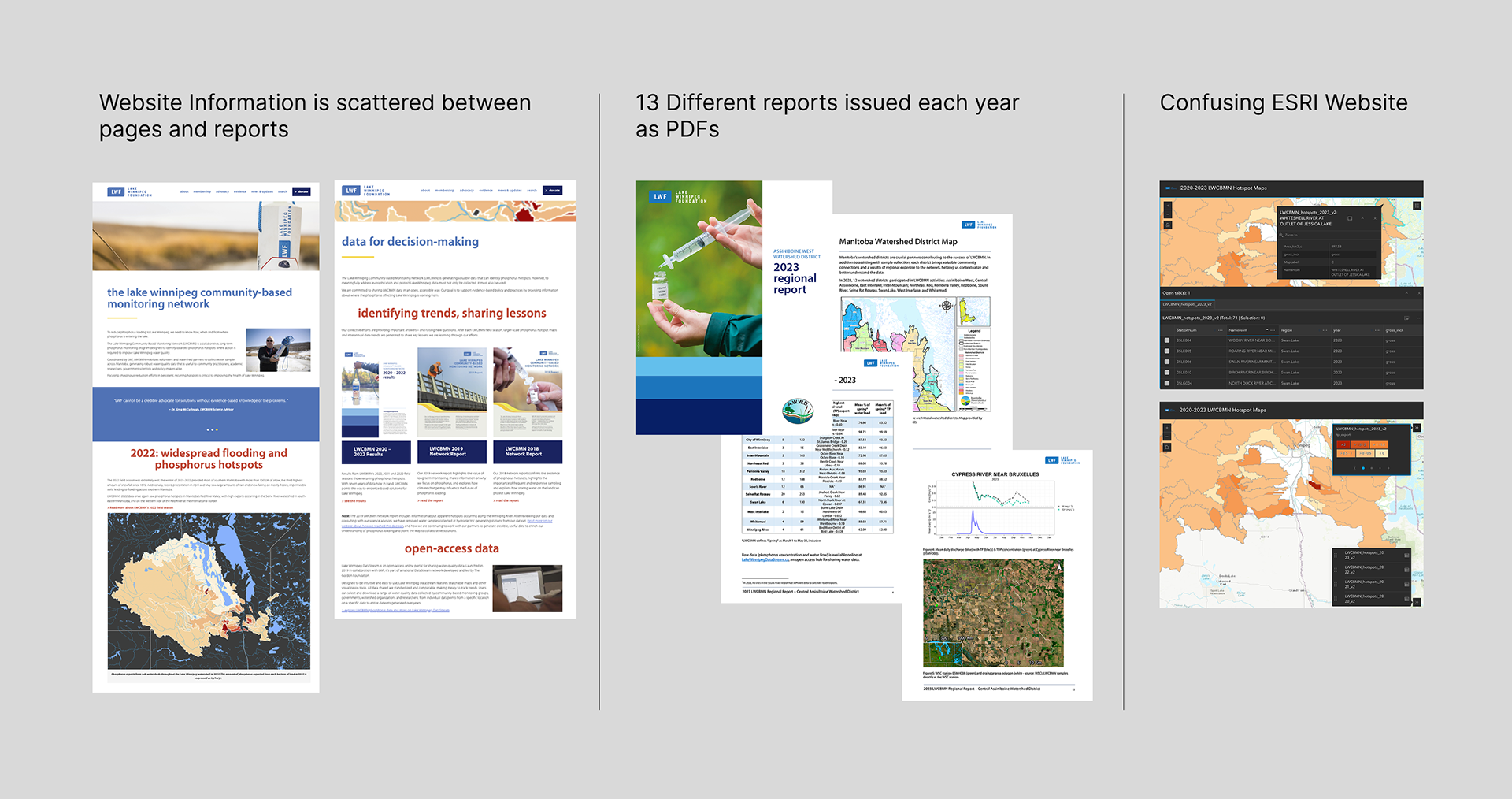
Phosphorus pollution threatens Lake Winnipeg's ecosystem, but existing data was fragmented across the current website content, stored in external platforms, and inaccessible to non-technical audiences. As a consequence, it discourages potential engagement for those interested in advocating for water rights in the Manitoba region. The foundation needed a digital platform within their ecosystem of content that would:
- Provide immediate visual context of which regions contribute most to phosphorus loads
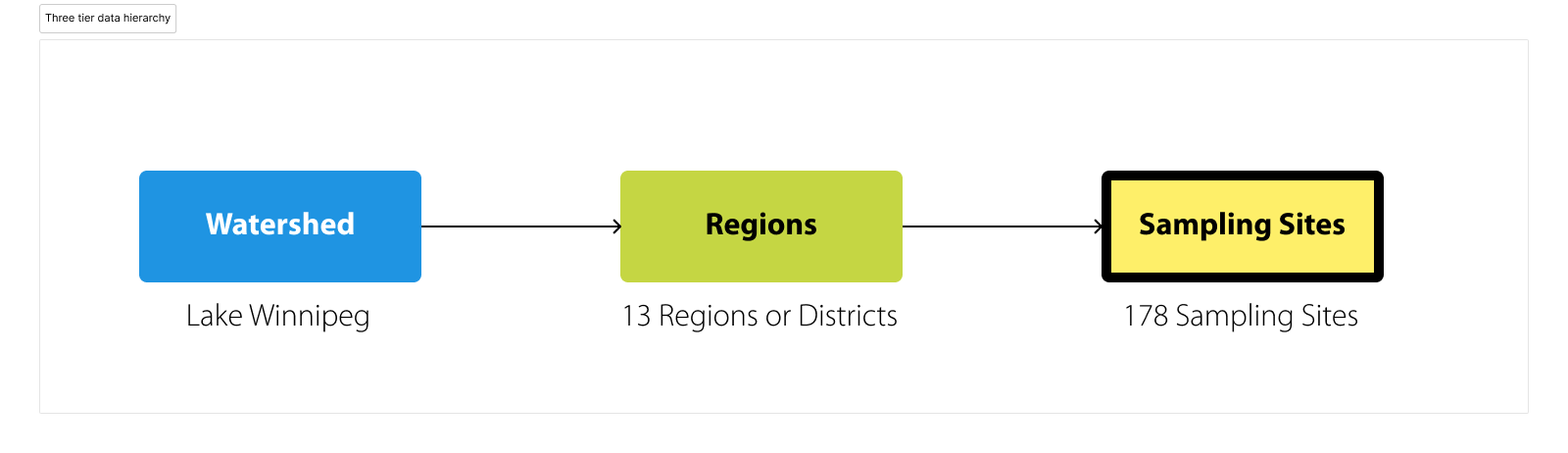
- Enable multi-level exploration from basin-wide overview to individual sampling sites
- Support both casual exploration and targeted research workflows
- Balance scientific rigor with public accessibility
Research & Discovery
In order to understand the users and stakeholders, I led interviews with the Lake Winnipeg Foundation team to map current user needs, data sources, and success criteria. Through these conversations, We identified three primary user segments: general public, community members, and policymakers/researchers.
First, the general public segment needs to understand "where" and "why" pollution happens to support environmental action. Second, the community members are interested in the impact of pollution on their livelihoods, and their neighbours. Finally, policymakers and researchers require regional comparisons and trend data to inform policy decisions, and a granular site-level data with search/filter capabilities for specific analysis.
Below is a fictionalized example based on the original personas created:
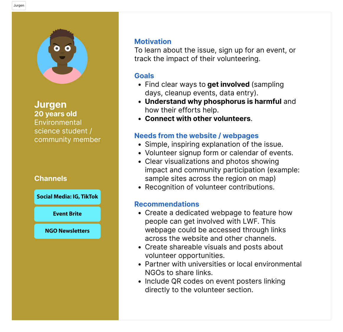
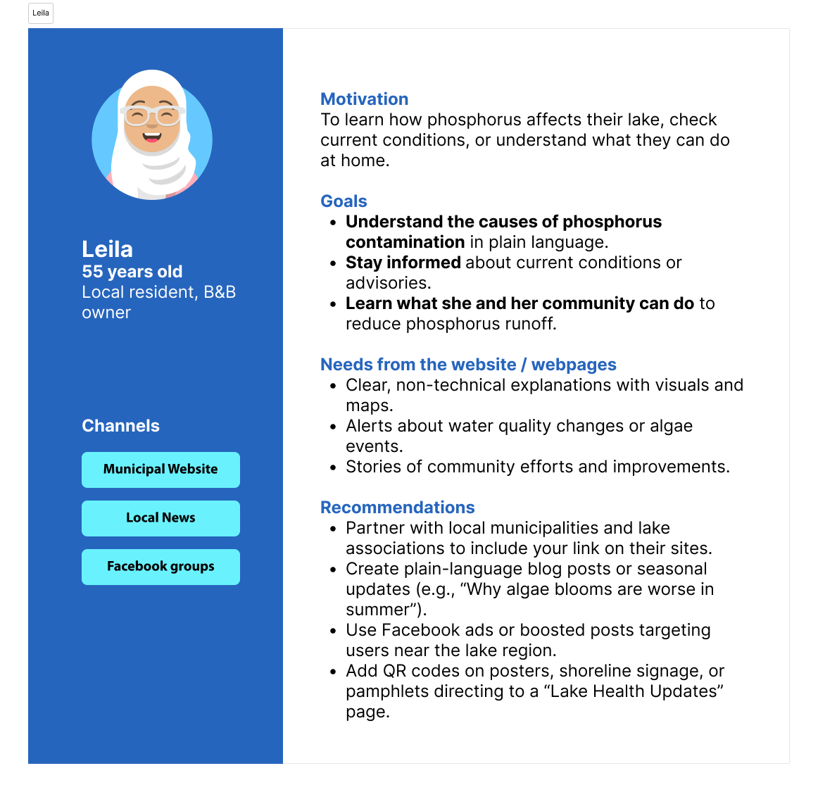
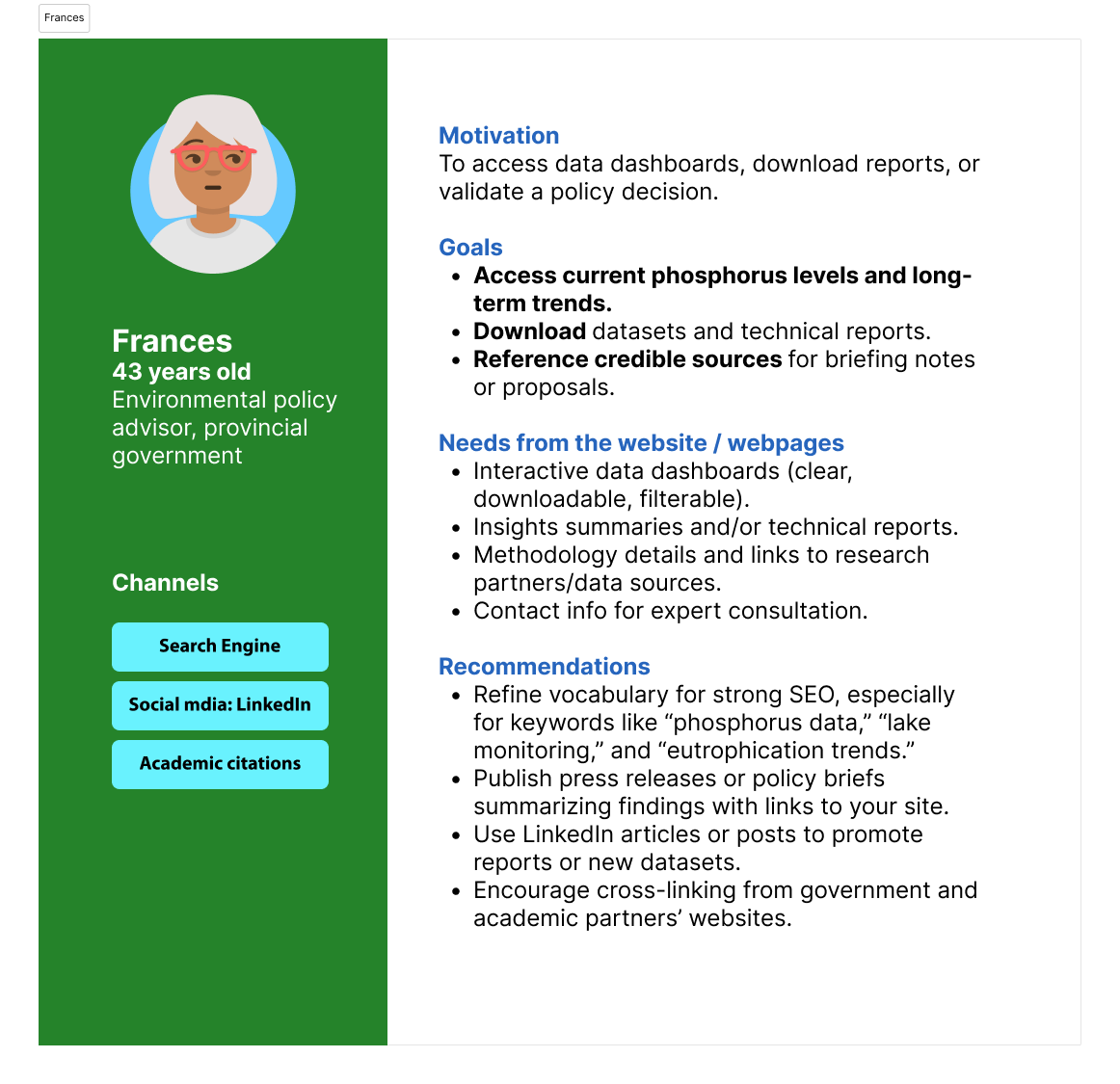
Based on these personas I structured the platform around progressive disclosure across three levels in order to guide the navigation design.
Design Process
User intention informing design navigation
User intention informing design navigation
In order to cater to the user segments previously described I designed navigation for user with two user intentions: explore and goal directed.
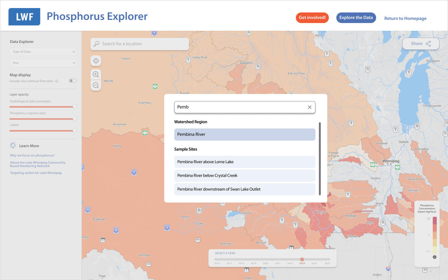
For the exploratory users, the landing page (in version 1 called phosphorus explorer) allows users to check on the interactive map with visual ranking which enables discovery through clicking. Region cards appear on selection with invitation to explore deeper.
For goal-directed users the data explorer page contains dropdow menus for direct region/site access, search by name or ID# for researchers with specific targets. Year selector for temporal analysis.
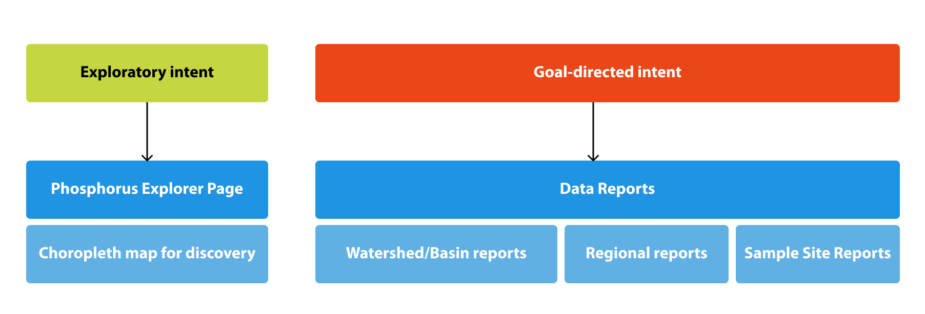
Information architecture for version one
Phosphorus explorer page
Spatial context provides intuitive understanding, with this in mind, I positioned an interactive map as the primary entry point. When users click a specific location, a card appears with a bar graph and "Explore Data" CTA. During the preliminary testing sessions, it was proved that 11 of 12 participants immediately grasped regional ranking without explanation.
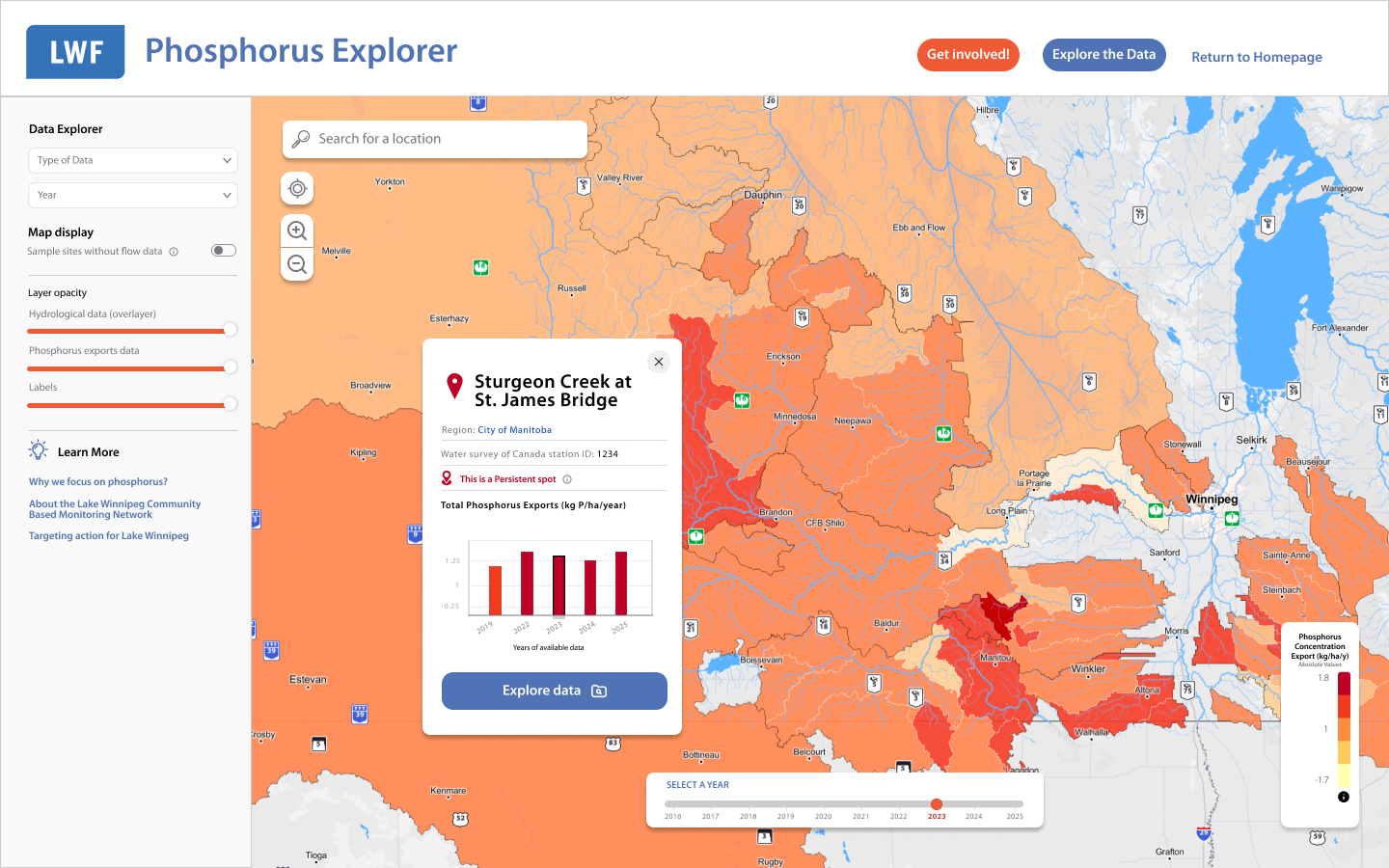
Displaying a sample site modal upon clicking on one of the sample site polygons.
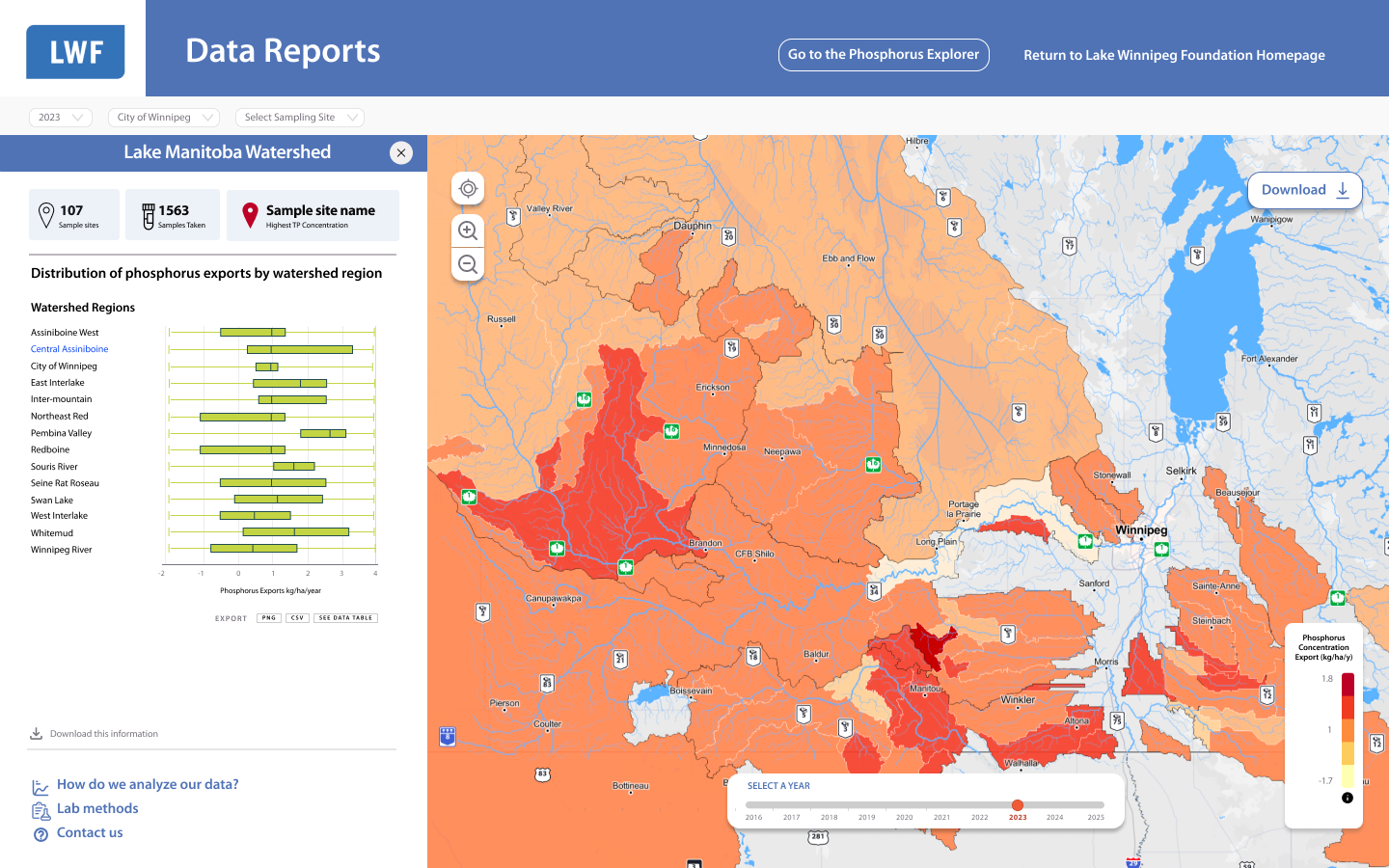
Data Reports Page

The original project brief estimated 4 data visualizations. Through stakeholder workshops and iterative prototyping, I identified the need for 10 distinct components to fully serve user needs, addressing spatial, temporal, and comparative data analysis.
I mapped each visualization to specific user tasks, prototyped consolidation alternatives, and built a case showing how targeted components improved data storytelling without adding complexity.
Visualization Strategy by Data Type
Spatial Analysis:
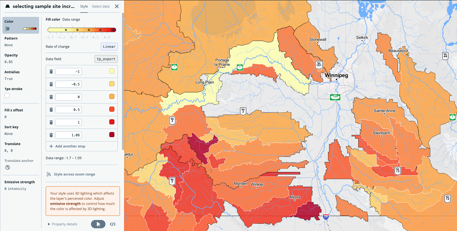
I designed an interactive choropleth map using Mapbox to reveal pollution hotspots across the Lake Winnipeg watershed. Users can immediately identify which regions contribute most to phosphorus loads through visual encoding.
I designed an interactive choropleth map using Mapbox to reveal pollution hotspots across the Lake Winnipeg watershed. Users can immediately identify which regions contribute most to phosphorus loads through visual encoding.
Distribution & Variability:
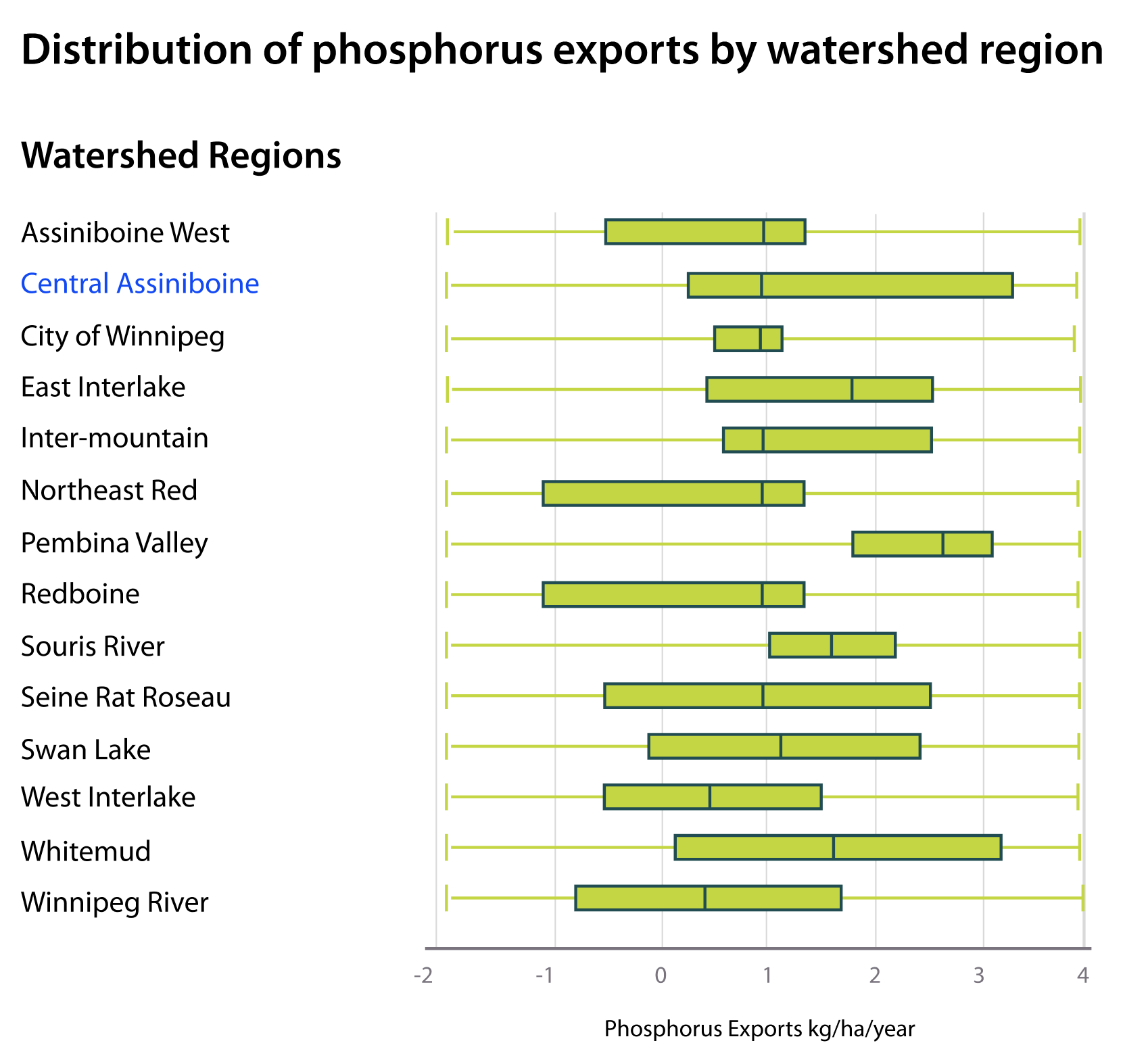
Box plots (version without outliers) display data spread across watershed regions, helping users identify statistical patterns and anomalies at a glance.
Box plots (version without outliers) display data spread across watershed regions, helping users identify statistical patterns and anomalies at a glance.
Proportional Composition:
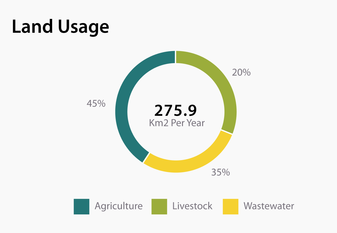
A pie chart shows land usage distribution, depicting how activities (agriculture, urban, natural) are scattered across each region.
A pie chart shows land usage distribution, depicting how activities (agriculture, urban, natural) are scattered across each region.
Year-over-Year Comparisons:
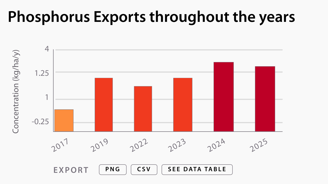
Bar graphs with color coding aligned to pollution levels enable users to track annual trends and identify improvement or degradation patterns.
Bar graphs with color coding aligned to pollution levels enable users to track annual trends and identify improvement or degradation patterns.
Temporal Trends:
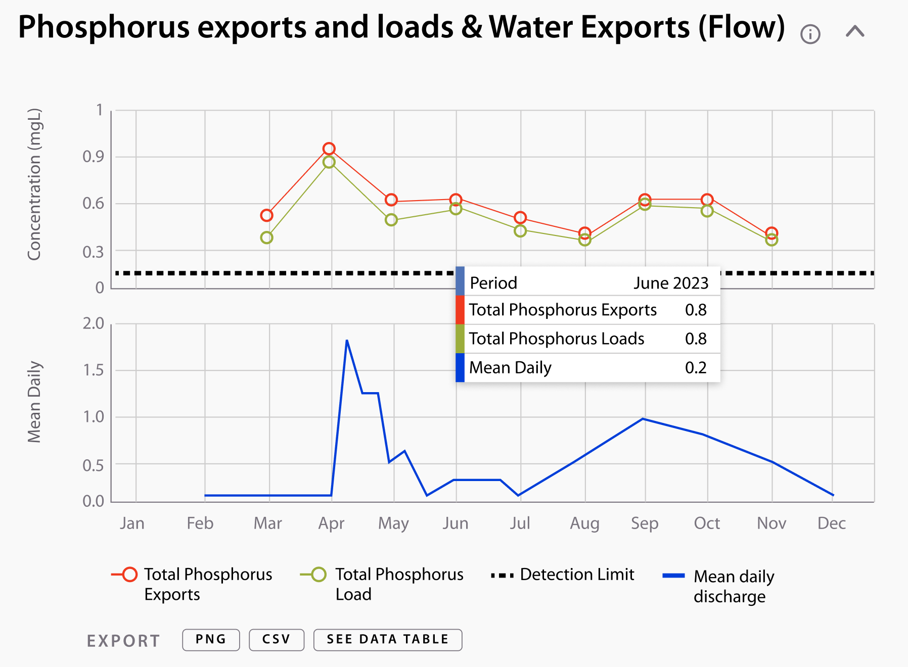
Line graphs with data point markers show month-by-month variations, revealing seasonal patterns in phosphorus levels and water flow across seasons.
Line graphs with data point markers show month-by-month variations, revealing seasonal patterns in phosphorus levels and water flow across seasons.
Check the website first iteration on the Phosphorus Explorer Website, and stay tuned for the next phase!