Swim Drink Fish is a non-profit organization based in Toronto that blends science, law, education, and storytelling with technology to empower millions of people to know and safeguard their waters. In 2017 the team at SDF put together the proposal to create the Great Lakes Guide, a platform that provides myriad information to encourage people to engage and feel connected to this valuable water resource.
My Role
I was responsible for leading the brand, user experience and design of this platform, producing all major deliverables and presenting these to the client between December 2017 and January 2019. I worked alongside two developers who focused on building the website, a writer, and received the support of BeWorks, a small team who conducted user research to support the design of the platform.
Process
In the initial stages of development, I gathered all necessary requirements and content to begin shaping the site’s information architecture. At the same time, I began developing the platform’s branding. Below are some images of this initial steps at Swim Drink Fish office.
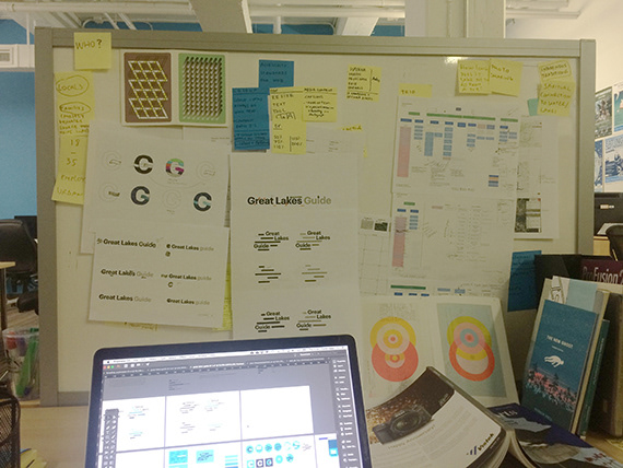
View of my desk while I was developing the brand of the Great Lakes Guide
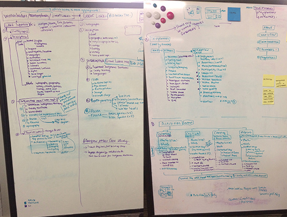
Discovery process to understand the overall content and information architecture architecture of the website
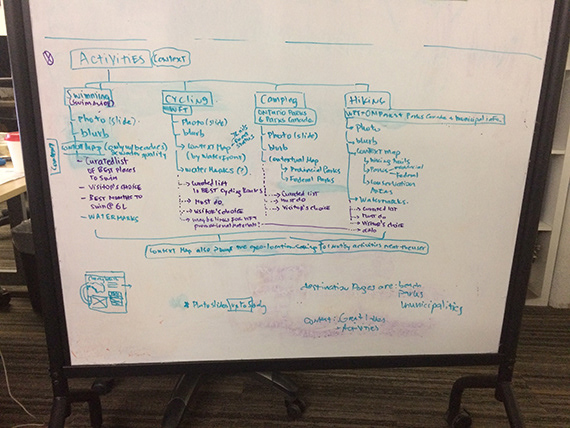
Close up on the ideation of IA for the ‘Activities’ section
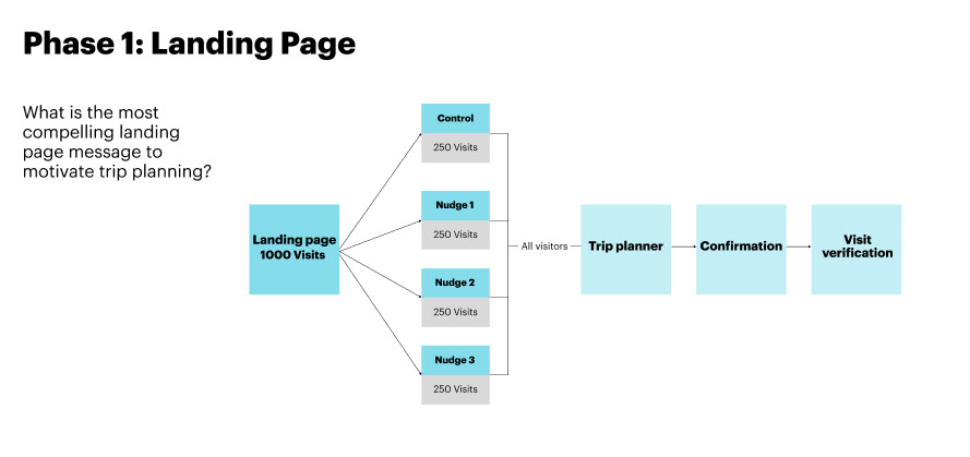
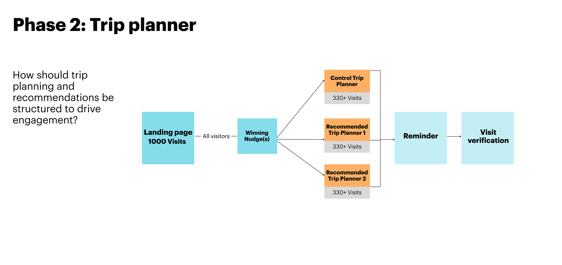
Preliminary Experimental Plan
As I began working on the first wireframes, we also developed early mockups for a user account feature that would allow visitors to plan and save trips, bookmark locations of interest, and access personalized content. To drive user interest and increase registrations, I collaborated closely with the user research team to explore strategies that could improve sign-ups.
We hypothesized that making the registration prompt more salient—such as displaying a pop-up when unregistered users landed on the homepage—would be effective. We tested different messaging strategies, including nudges based on loss aversion. For example: “Don’t miss out on what registering can offer you” followed by a list of benefits.
Below is an example of the preliminary experimental plan we created. It included a set of key research questions and two phases of testing. We were able to complete phase one, conducting a click-through test with a sample of approximately 80 users across Ontario.
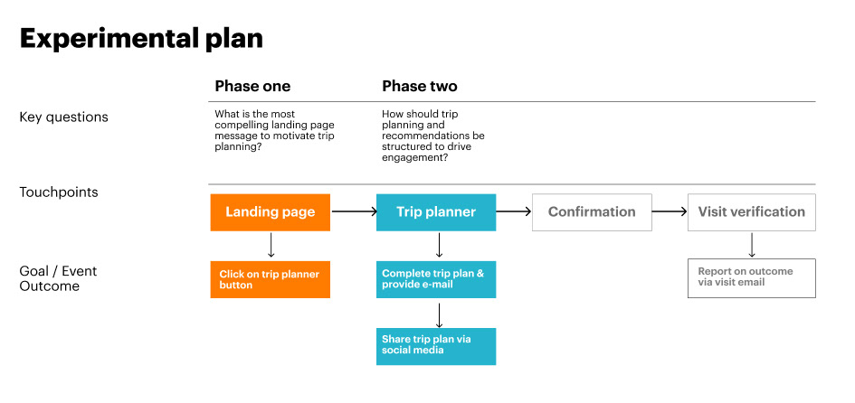
Sample view of the preliminary experimental plan
Wireframes
I translated the information architecture and initial sketches into wireframes using Figma. Once the website’s structure was approved, I added images and primary headings to bring the layout to life. At this stage, we conducted preliminary user testing focused on key features such as the registration nudges and the trip planning tool. We also evaluated the site’s accessibility across devices to ensure it was usable for all users.
Designing the Great Lakes Guide brand
To develop the brand for the Great Lakes Guide, I immersed myself in the region's rich environmental and cultural narrative. Drawing inspiration from the natural landscapes, local communities, and unique ecosystem of the Great Lakes, I aimed to create a brand identity that resonates with the platform's mission to connect people to the water and foster a sense of stewardship.
The logo I designed features five horizontal lines, each representing one of the Great Lakes. These lines subtly mimic the shimmer of glistening water, capturing the essence of the lakes' beauty while creating a minimalist, memorable mark that aligns with the platform's environmental focus.
For the color palette, I selected a modern blue, complemented by shades of gray and red. These colors were chosen not only to evoke the natural tones of the lakes and surrounding landscape but also to ensure full accessibility, meeting AAA compliance standards for clarity and inclusivity.
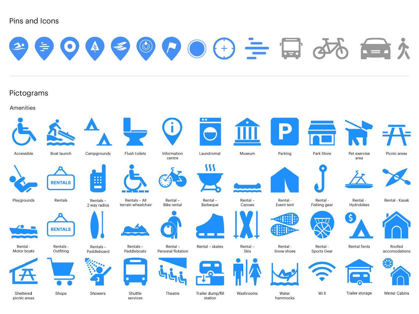
A sample of the iconography and pictograms I developed for the website interface
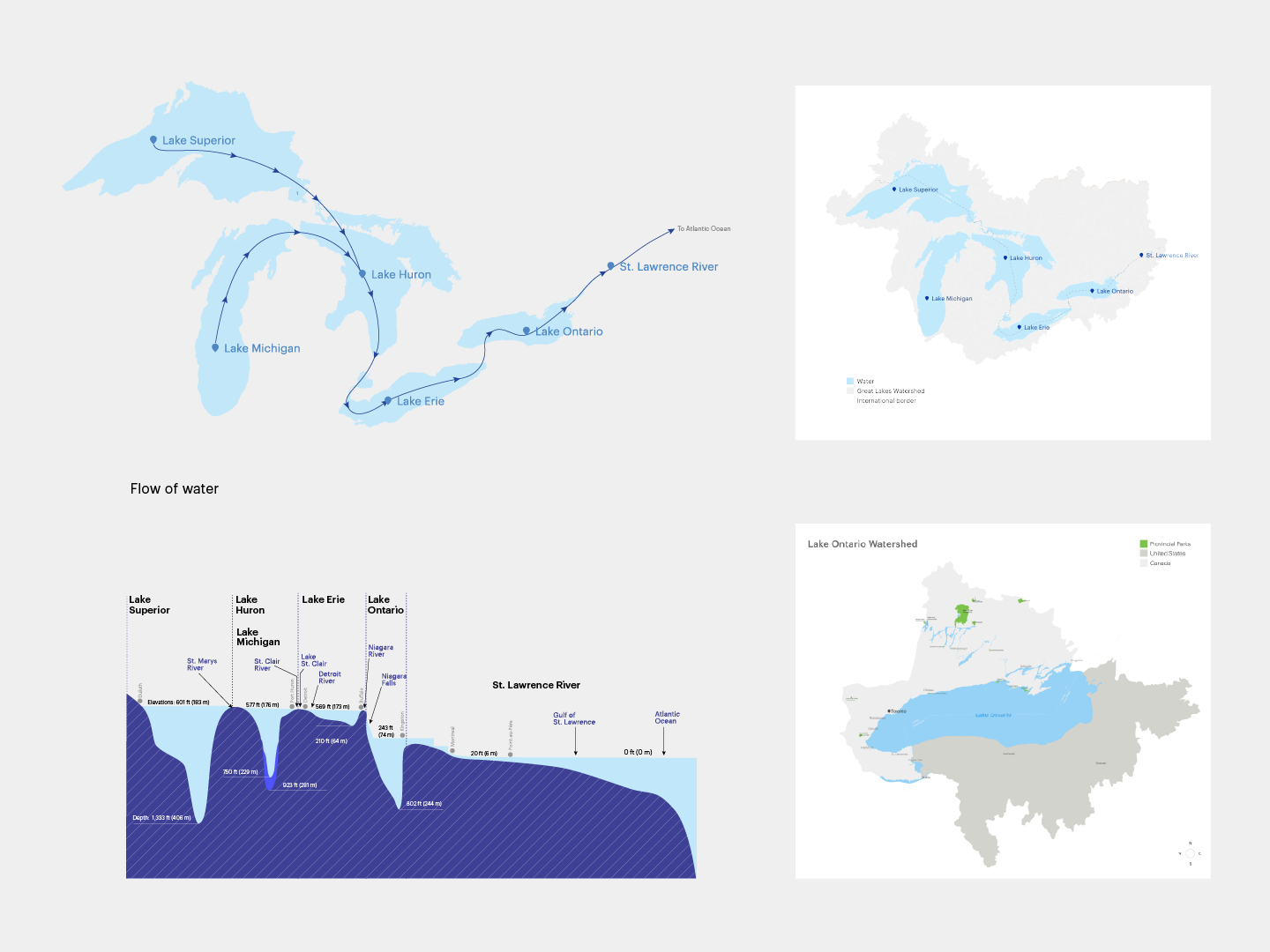
I created a myriad of maps and infographics to illustrate complex concepts such as the bathymetry of the Great Lakes and the extent of them across two countries
Putting everything together
Once we completed the development of our launching content, and branding, I moved on to design of the final screens. My goal was to create a platform with visual identity that was aligned with the brand’s values and message.
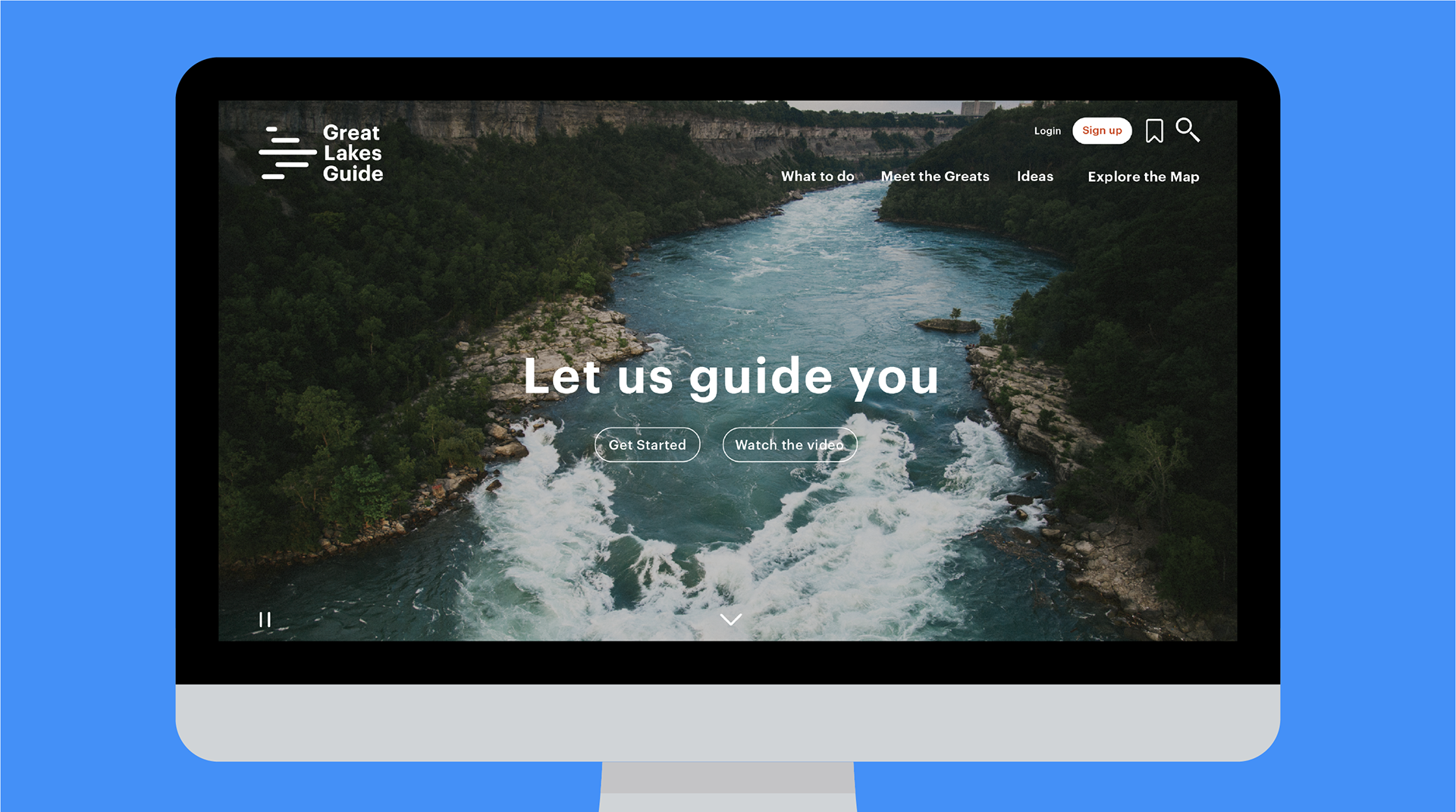
Homepage
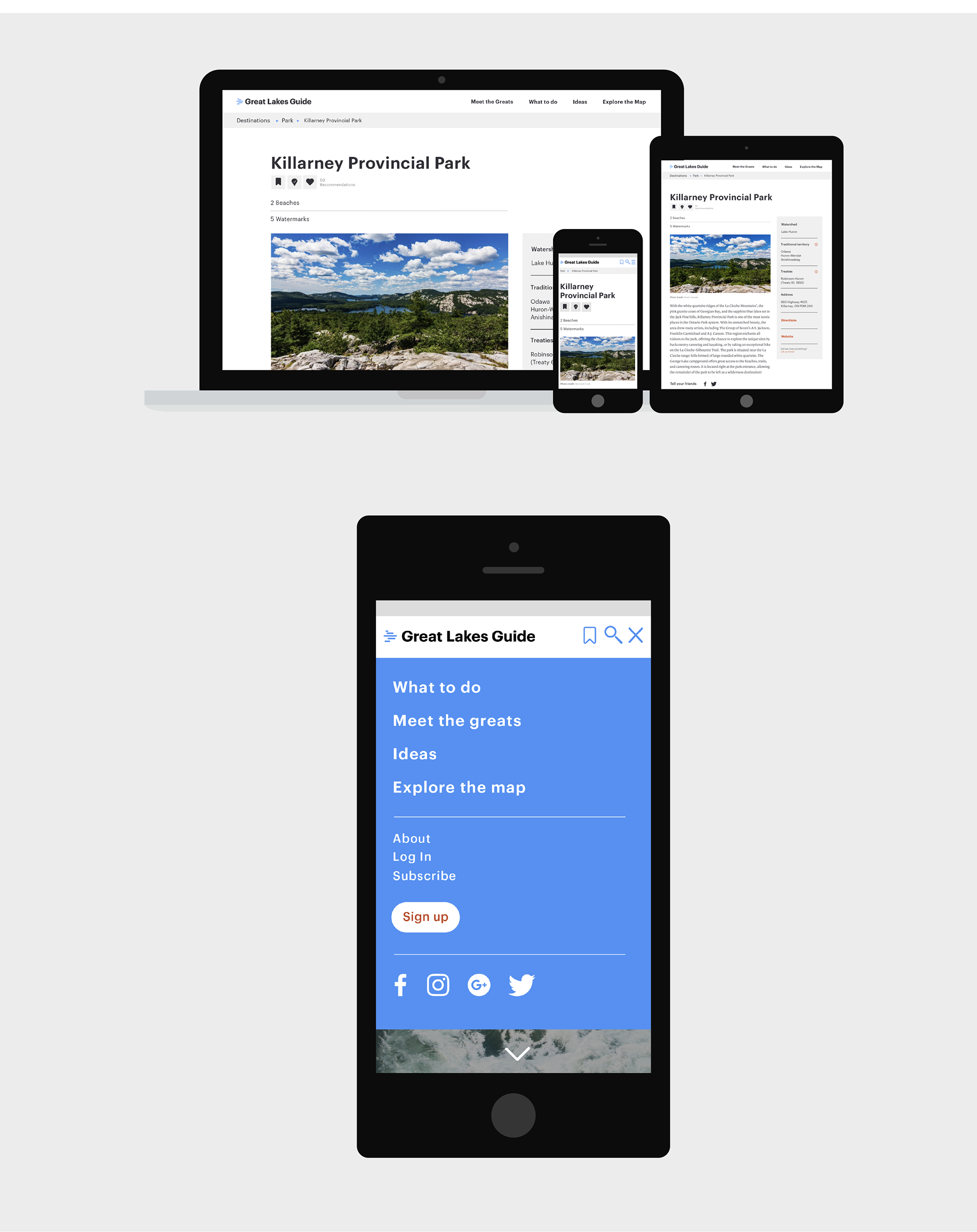
Design of destination pages for different platforms
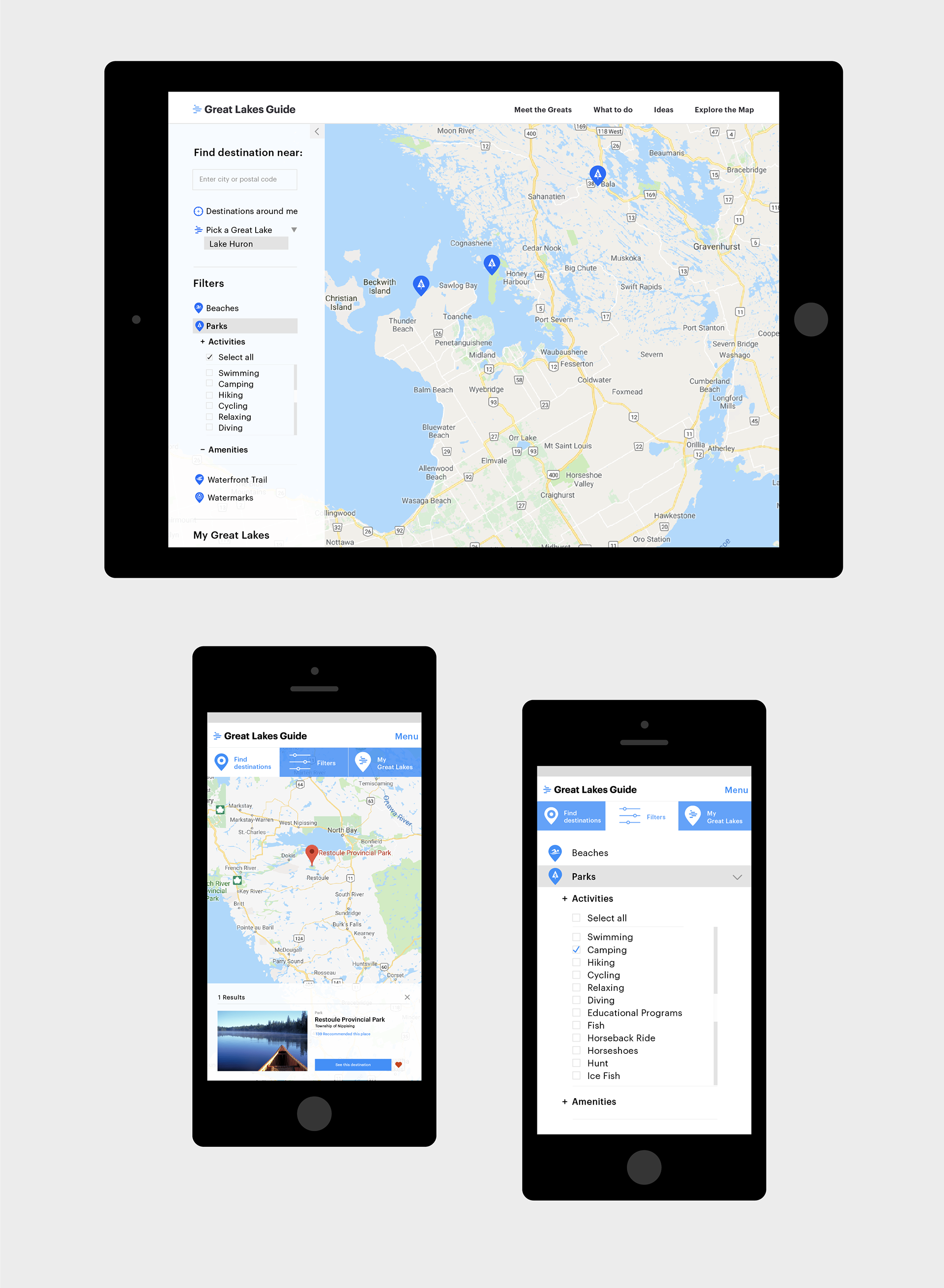
High resolution mobile and desktop prototype for an interactive map to find hundreds of activities, parks and trails.
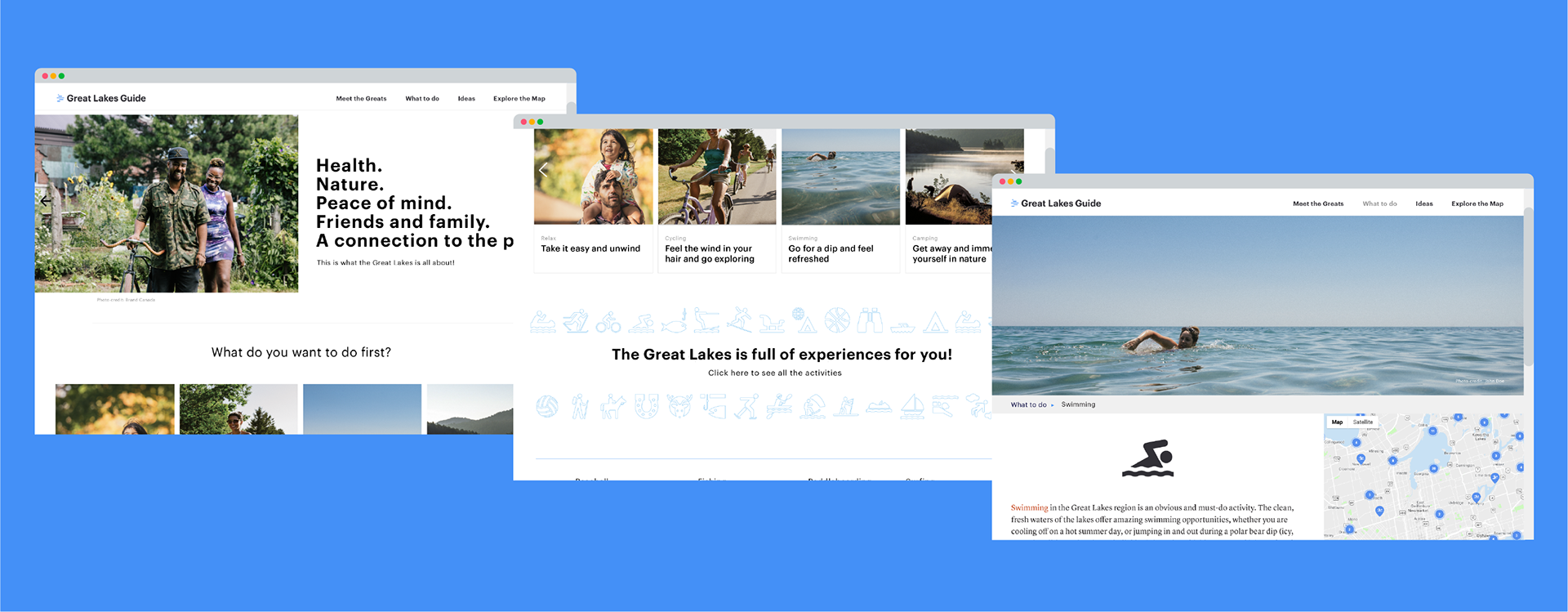
Screens of the ‘Activities’ and ‘What To Do’ pages
Prototype for the mobile version of user registration and Sign-In
Learnings
This was one of the first projects where I had full creative and UX ownership—from architecture to interface design. I collaborated closely with researchers and developers, gaining deep insights into user behavior, technical feasibility, and interdisciplinary workflows.
It was eye-opening to see how behavioral data could directly shape features used by thousands of people. I also deepened my understanding of SEO and digital engagement strategies needed to reach and retain targeted audiences.
Most importantly, this experience sharpened my awareness of accessibility and the responsibility to deliver inclusive, trustworthy content.
Next Steps
Although this project is over five years old and has evolved since my involvement, the trip planning feature is one I would have loved to expand. Today, with AI-enabled personalization tools, there’s exciting potential to help users make smarter, more informed decisions about their visits and water-related activities.